



CSS and Javascript are languages that help us design pages that are both lightweight and captivating. Slider-style designs like these help visitors focus more on the website compared to other interfaces.
To create a slider, please follow the instructions below.

Step 1Create website structure
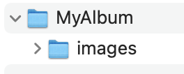
Step 2Use any web design tool, such as Visual Studio Code. Then open the MyAlbum website to start designing.

Step 3Create a webpage named album.html with the following structure:

Step 4: Presenting content for the website, displaying images on the web.
<div class="”slider”">
<div class="”slide" slide-1″>
<div class="”slide-bg”"></div>
<div class="”slide-content”">
<div class="”slide-image”">
<img src="”images/VM1.jpeg”">
</div>
<div class="”slide-text”">
<p>
How wonderful!
</p>
</div>
</div>
</div>
<div class="”slide" slide-2″>
<div class="”slide-bg”"></div>
<div class="”slide-content”">
<div class="”slide-image”">
<img src="”images/VM2.jpeg”">
</div>
<div class="”slide-text”">
<p>
Studying Information Technology at Viet My is Easy.
</p>
</div>
</div>
</div>
<div class="”slide" slide-3″>
<div class="”slide-bg”"></div>
<div class="”slide-content”">
<div class="”slide-image”">
<img src="”images/VM3.jpeg”">
</div>
<div class="”slide-text”">
<p>
Okay, let's choose Information Technology to pursue our passion!
</p>
</div>
</div>
</div>
</div>
<div class="”slider-controls”">
</div>
Step 5: Enhance your website's appearance using CSS in the style section.
* {
font-family: sans-serif;
}
body {
margin: 0;
}
.slider {
width: 100%;
height: 100vh;
}
.slide {
width: 100%;
height: 0;
display: flex;
visibility: hidden;
overflow: hidden;
}
.slide.active {
display: flex;
height: 100%;
visibility: visible
}
.slide-bg {
height: 100%;
clip-path: polygon(0 0, 0 90%, 150% 0%);
z-index: 1;
position: absolute;
top: -100%;
width: 100%;
}
.slide.active>.slide-bg {
top: 0;
-webkit-transition: all 1s ease;
-moz-transition: all 1s ease;
-ms-transition: all 1s ease;
-o-transition: all 1s ease;
Procedure: All 1s ease;
}
.slide-image>img {
z-index: 2;
opacity: 0;
}
.slide.active .slide-image>img {
opacity: 1;
-webkit-transition: opacity 2ss ease-in;
-moz-transition: opacity 2s ease-in;
-ms-transition: opacity 2s ease-in;
-o-transition: opacity 2s ease-in;
transition: opacity 2s ease-in;
}
.slide-image>img {
max-height: 100%;
max-width: 100%;
z-index: 1;
}
.slide-content {
max-width: 900px;
max-height: 90%;
margin: auto;
z-index: 2;
position: relative;
padding-left: 150px;
}
.slide-image-bg {
width: 0;
height: 100%;
position: absolute;
top: 0;
z-index: 1
}
.slide.active .slide-image-bg {
width: 100%;
-webkit-transition: all 1s ease;
-moz-transition: all 1s ease;
-ms-transition: all 1s ease;
-o-transition: all 1s ease;
Procedure: All 1s ease;
}
.slide-text {
background-color: #fff;
padding: 1em 2em;
position: absolute;
top: 40%;
left: -100%;
z-index: 3;
width: 250px;
box-shadow: 1px 1px 10px 0px rgba(0, 0, 0, 0.2);
text-align: justify;
}
.slide.active .slide-text {
left: 0;
-webkit-transition: all 2s ease;
-moz-transition: all 2s ease;
-ms-transition: all 2s ease;
-o-transition: all 2s ease;
transition: all 2s ease;
}
.slide-1 .slide-text {
border-left: 10px solid darkslategray;
}
.slide-1 .slide-bg {
background-color: cadetblue;
}
.slide-2 .slide-text {
border-left: 10px solid burlywood;
}
.slide-2 .slide-bg {
background-color: antiquewhite;
}
.slide-3 .slide-text {
border-left: 10px solid darkslateblue;
}
.slide-3 .slide-bg {
background-color: deepskyblue;
}
.slider-controls {
position: absolute;
z-index: 5;
bottom: 25px;
right: 25px;
}
.btn-slide-next,
.btn-slide-previous {
cursor: pointer;
width: 60px;
height: 50px;
color: #000;
font-weight: bold;
font-size: 20px;
Progression: 0.6s ease;
user-select: none;
background-color: #fff;
border: 1px solid #000;
}
.btn-slide-previous:hover,
.btn-slide-next:hover {
background-color: #000;
border: 1px solid #fff;
color: #fff;
}
Step 6: The final step uses JavaScript to make the page interactive – meaning that when the user clicks on the arrow buttons, the image will change.
document.addEventListener(“DOMContentLoaded”, function() {
setTimeout(function() {
document.querySelector(“.slide”).classList.add(“active”);
}, 500)
});
function nextSlide() {
let currSlide = document.querySelector(“.slide.active”),
nextSlide = currSlide.nextElementSibling;
currSlide.classList.remove(“active”);
if (nextSlide) {
nextSlide.classList.add(“active”);
else {
document.querySelectorAll(“.slide”)[0].classList.add(“active”);
}
}
function previousSlide() {
let currSlide = document.querySelector(“.slide.active”),
prevSlide = currSlide.previousElementSibling,
slideCount = document.querySelectorAll(“.slide”).length;
currSlide.classList.remove(“active”);
if (prevSlide) {
prevSlide.classList.add(“active”);
else {
document.querySelectorAll(“.slide”)[slideCount – 1].classList.add(“active”);
}
}
Conclude: Following the instructions above, you have created a beautiful photo album in slider format. From here, you will have many more options in finding ideas for sliders.
Author: Thy Dao Quoc - Date written: March 23, 2023
Category: Training program, IT - Website Design, IT - Software Applications, Information Technology - Software Applications, TECHNOLOGY AND ENGINEERING SECTOR

0 thoughts on “Cách Tạo Slider với CSS và JavaScript”